
UI Component Library
@zephyrcloudio/ui is the shared component library behind The AI Platform. Every surface in the desktop app is built from it. Miniapps get a portable subset of it — not the whole library — through @theaiplatform/miniapp-sdk/ui; see Agent-readable catalog.
Browse the library in the component explorer — stories for most components across all four tiers, in both light and dark themes. Some templates have no story yet, so the explorer is a wide sample rather than a complete API reference.
The explorer is a separate static app, not an Rspress route, so /ui/ 404s under rspress dev. Two ways to see it locally:
Both paths need the workspace packages built first: Storybook loads the app's globals.css, whose imports resolve to generated dist output. turbo run build-storybook pulls those builds in through its dependsOn, while a bare pnpm --filter … build-storybook skips the graph and fails on a clean checkout — which is also why the docs build's mount step aborts when Storybook was never built.
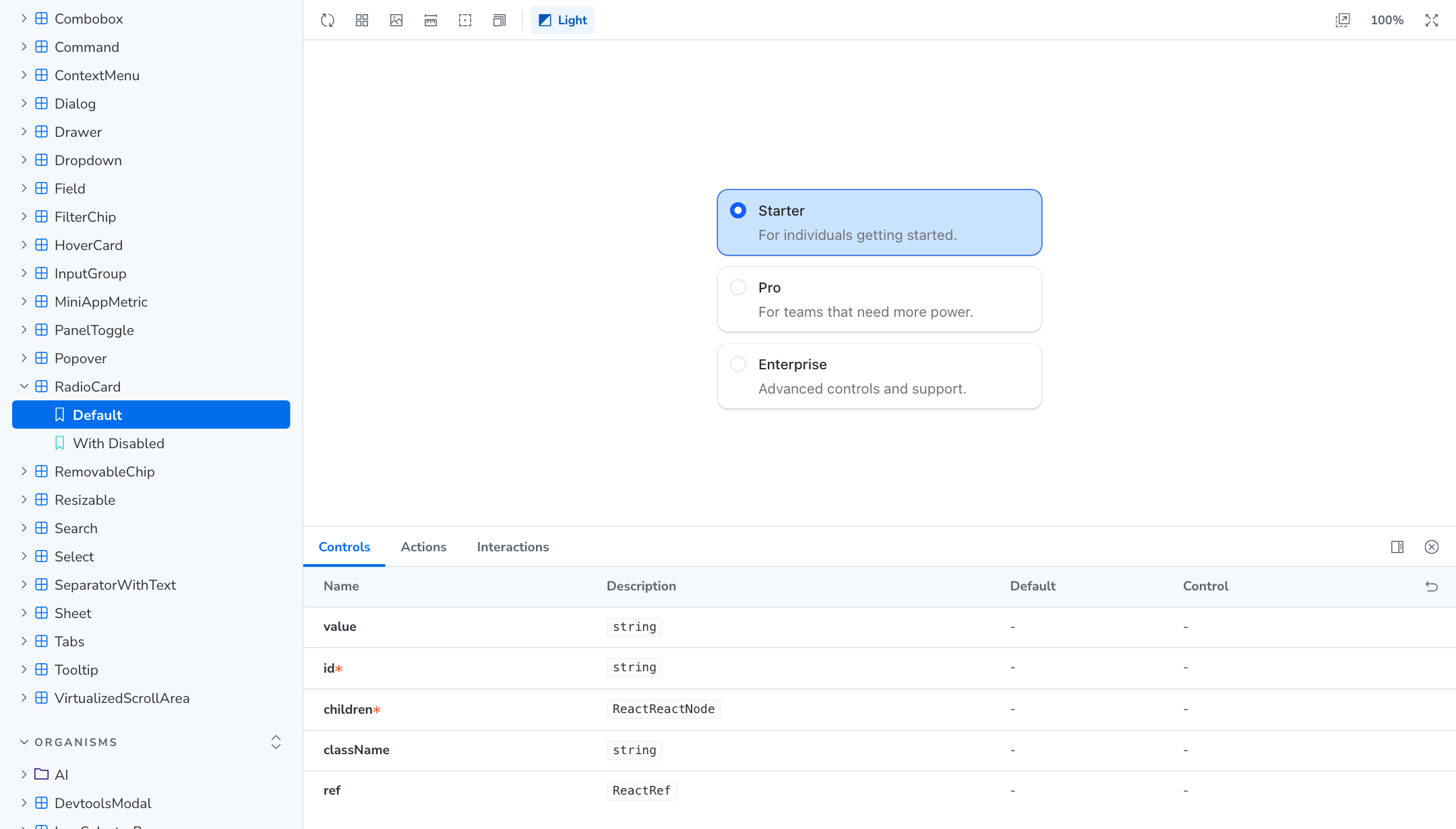
Pick a component on the left, change its props in the Controls panel, and switch themes from the toolbar.
What you get
The library is organized into four tiers:
Two domain families cut across those tiers. ai covers chat and agent components including prompt input, conversation, and chain of thought. brand covers provider logos for Anthropic, OpenAI, Amazon Bedrock, and the rest.
Tiers describe how the package is organized internally. They never appear in import paths. See Importing components below.
Installing
The package is published to GitHub Packages, so installing it needs a registry entry and a GitHub token with read:packages on the ZephyrCloudIO organization.
Add the scope to your .npmrc:
Then install the package and its React peers:
react and react-dom are peer dependencies. The library does not bundle its own copy. lucide-react is a dependency of the package rather than a peer, but a strict package manager will not let your own code import it unless you declare it too — and the icon usage below does.
Tailwind CSS v4 is required, not optional. The package ships no compiled component CSS: theme.css declares the tokens, and tailwind.css publishes their semantic color mappings and scans the package for class names. The class names on every component are emitted by your Tailwind build, so without it the components render unstyled.
Register the PostCSS plugin:
Then import all three stylesheets:
These imports provide the shared semantic color utilities, including bg-primary, text-primary-foreground, and hover:bg-primary-hover. Remove any copied shared color mappings from the desktop app; the package now owns those mappings. The token values follow the active light or dark theme.
Icon glyphs come from lucide-react. It is a dependency of the library rather than a peer, but pnpm does not hoist it, so add it too if you pass glyphs to Icon yourself:
Building a miniapp? You do not need any of this. @theaiplatform/miniapp-sdk/ui is public on npm and re-exports the portable components with no authentication. See the Miniapp UI reference.
Importing components
Import paths are tier-free. A component's specifier is its own name, whatever tier it happens to live in:
The two domain families keep their prefix:
Barrel imports pull from the whole library or the whole ai family at once:
Prefer the per-component specifiers. They let your bundler drop everything you did not import.
Because paths carry no tier, a component moving between tiers never breaks your imports. The specifier is stable even when the internal file location is not.
Theming
The library owns its design tokens. Import the theme stylesheet once, near the root of your app:
That single import defines every token for both light and dark themes. Colors, surfaces, radii, shadows, and typography all come from it.
Style your own markup with the Tailwind utilities that reference those tokens:
Use the semantic token utilities rather than raw color values. bg-card follows the active theme. A hardcoded hex does not, and will look wrong in one of the two themes.
Dark mode is a class on the document root. Toggle dark on <html> and every token switches.
Do not read tokens through var(--token) directly, and do not hardcode colors or spacing. The Tailwind utilities are the supported surface. Token names are free to change between releases.
Import the library's Tailwind entry alongside the theme. It adds the @source scan that lets your build discover the class names used inside the package — without it Tailwind never emits them:
This entry also publishes the @theme inline color mappings that generate semantic utilities such as bg-card and text-muted-foreground. Consumers do not need to copy those mappings from the desktop app.
Icons and headings
Two component families have a single supported entry point.
Render icons through Icon rather than reaching for a raw SVG or a lucide-react component:
Size icons with the size prop, never with width or height utility classes.
Render headings through the H1 to H6 components rather than raw heading tags:
Both carry the type scale and spacing the rest of the library expects.
Agent-readable catalog
The package ships a machine-readable catalog of the component subset that is portable to miniapps, grouped by family:
It exists so a specialist can pick the right component when generating miniapp UI: its import specifiers point at @theaiplatform/miniapp-sdk/ui, not the full @zephyrcloudio/ui surface, and it lists the portable subset rather than every component or its variants. For anything outside that subset, browse the component explorer or read the export map in packages/ui/package.json — the explorer covers most, but not all, exported components.
Component explorer
The component explorer is the reference for everything above. Each component page lists its variants, sizes, and states, with a controls panel for changing props live and a theme switcher for checking both themes.
Start there when you are looking for a component. Come back here for how to install and import it.